The 14 Best React Component Libraries for Fast, Scalable UI

Why React Component Libraries Matter Today
How many hours do you still spend rebuilding the same buttons, forms, and modals? Top teams don’t. They use the best React component libraries to stop rework and move faster.
Think of a component library as a master toolkit: pre-built, tested, and designed to work together. With the right React UI library, teams skip weeks of repetitive UI and accessibility testing and focus on features that make the product stand out.
The Hidden Cost of Building Without Component Libraries
Many teams “move fast” by building custom components. Six months later, the app feels uneven. Dropdowns behave differently. Accessibility slips. Refactors eat more time than the original build.
What looked like a shortcut becomes technical debt - slow and expensive to maintain.
What You’ll Learn from the 14 Best Libraries
These React component libraries don’t just boost speed. They also bring:
- Consistent UI across your whole app
- Built-in accessibility (WCAG)
- Production-tested parts used by thousands
- More time for real business problems, not reinventing UI
This guide explores the 14 best React component libraries shaping scalable UI development in 2025. You'll discover:
- Which React design systems enforce patterns out of the box
- Which options give full creative freedom
- Trade-offs between pre-styled and headless libraries
- How to avoid common pitfalls that slow development teams
- Performance notes and bundle size comparisons
- Real-world use cases and setup ideas
These tools power tomorrow's best digital products and help teams build interfaces that scale effortlessly. Whether you're choosing between Material UI and shadcn/ui, or exploring headless options like React Aria Components, this guide provides the insights you need.
For more context on modern React development trends, explore our related resources on React UI development best practices (opens in new tab) and component-driven design patterns (opens in new tab).
What Makes the Best React Component Libraries Stand Out
Not all component libraries are created equal. Some may look polished but hide problems under the hood. When evaluating the best React component libraries for modern UI development, several key factors separate the leaders from the rest:
Active maintenance: A library that's abandoned quickly turns into a liability. Teams need libraries with regular updates, security patches, and compatibility with the latest React versions.
Strong community support: More contributors mean bugs get fixed faster and new features appear sooner. It's like buying a car with a global service network not just one mechanic in town.
Accessibility: Great libraries follow accessibility best practices, so everyone can use the application. Material UI implements Google's Material Design system with built-in accessibility, as detailed in their documentation.
Theming and customization: Teams need components to match their brand without wrestling low-level code for hours. Modern React UI libraries should support dark mode and flexible theming out of the box.
Developer experience: Clear docs, TypeScript support, and smooth integration turn "just another tool" into productivity rocket fuel.
Modern standards aren't hype - they save time and money. Think of it like building with Lego blocks versus carving each piece by hand. It’s like using Lego blocks instead of carving parts by hand. If your library lacks dark mode or server-side rendering, you’ll waste days rebuilding basics while competitors ship new features.
Scalable libraries, like those highlighted in Prismic's 2025 roundup (opens in new tab), help teams grow painlessly as user needs change and products evolve. The best React component libraries blend current best practices with future-proof tech. That's how teams build fast, and stay fast.
The 14 Best React Component Libraries in 2025
Choosing a React UI library is about fit, not just features. Business apps, SaaS dashboards, and marketing websites all need different approaches. Here's how the top React libraries stack up in real-world development scenarios.
1. Untitled UI React - Enterprise-Grade Component System
Untitled UI React is a comprehensive, modern React component library built for speed and scale. It includes 5,000+ production-ready components with Tailwind + TypeScript.
Best for: Teams who want enterprise-level polish without vendor lock-in.
Pros:
- Massive set of unique components (video players, editors)
- No runtime dependencies - copy the code, own the code
- Seamless design-code sync with Untitled Figma kits
- Built on actively maintained accessibility primitives
- Custom CLI tool for rapid installation
Cons:
- Overwhelming for small projects
- Manual updates required for new releases
- Full access requires paid upgrade
2. shadcn/ui (Shadcn UI) - The Developer's Choice
shadcn/ui lets teams copy-paste accessible components styled with Tailwind CSS and powered by Radix UI. Developers get full control to tweak every detail.
Best For: Developers who want flexibility over package abstraction.
Pros:
- Total ownership - developers modify as needed
- CLI speeds up integration into projects
- Well-integrated with AI-driven tools like Bolt.new
- Strong community with extensive third-party extensions
Cons:
- Relies on Radix UI (now sunsetted)
- Updates are manual, not automatic
- Design can look generic unless customized
3. Tailwind Plus - Premium Design Quality
Tailwind Plus (formerly Tailwind UI) delivers hundreds of premium HTML/React/Vue components crafted by Tailwind CSS creators themselves.
Best for: Fast-moving teams focused on marketing or SaaS sites who value stunning design out-of-the-box.
Pros:
- Pixel-perfect layouts for landing pages and dashboards
- Clean code that adapts to any project structure
- Heroicons integrates seamlessly
- Professional design quality maintained by core Tailwind team
Cons:
- Paid only; no free tier available
- Manual copy-paste workflow means extra upkeep
- Lacks first-party Figma kit
4. Kibo UI - Specialized Components
Kibo UI fills gaps left by other libraries, offering niche yet powerful React components like stories or comparison decks - all open source.
Best for: Projects using shadcn/ui needing advanced widgets missing from core registries.
Pros:
- Open-source with a strong accessibility focus
- Unique "AI-ready" Model Context Protocol support
- Specialized components not found elsewhere
Cons:
- Not suitable as a standalone UI library - supplemental only
- Smaller component selection compared to full libraries
- Based on Radix UI (maintenance concerns)
5. React Aria Components - Headless Accessibility Powerhouse
React Aria Components offers unstyled but deeply accessible primitives from Adobe's team. It's ideal for teams wanting to build a custom system from scratch without sacrificing WCAG compliance.
Best for: Custom design systems demanding perfect accessibility and flexible styling.
Pros:
- Complete internationalization support (30+ languages)
- Maximum design flexibility with unstyled components
- Actively maintained by Adobe
- Excellent for building proprietary design systems
Cons:
- All styling is on developers; steep learning curve at first
- More verbose code compared to pre-styled libraries
- Requires strong CSS expertise
6. Material UI (MUI) - The Enterprise Standard
Material UI remains one of the most battle-tested React component libraries (opens in new tab). It implements Google's Material Design system with deep theming options and ready-to-use data grids - trusted by enterprises worldwide, as noted in Technostacks' review (opens in new tab).
Best for: Large-scale web apps needing proven solutions and robust documentation.
Pros:
- Immense ecosystem with active community support
- Comprehensive component library covering most use cases
- Excellent for data-driven applications
- Strong documentation and resources
Cons:
- Default styling feels dated to some users
- Large bundle size without careful optimization
- Opinionated Material Design aesthetic
7. Reshaped - Neutral Design Foundation
Reshaped provides neutral yet modern core React components that work out-of-the-box or as foundations for larger systems.
Best for: Product teams looking to blend into any brand style without heavy customization effort.
Pros:
- Responsive syntax adapts layouts quickly
- Neutral design works with any brand
- No CSS-in-JS dependencies
- Clean and maintainable code
Cons:
- Missing marketing/landing blocks
- Relies on third-party icon libraries
- Smaller community compared to established libraries
8. AlignUI - Design-to-Code Workflow Excellence
AlignUI combines Figma kits and over 180 meticulously designed React UI components. It's built using a Radix/Tailwind hybrid approach.
Best for: Designers collaborating directly with developers on seamless handoffs.
Pros:
- Bridges Figma designs straight into codebase
- High-quality default design
- Comprehensive component selection
- Focus on design-development workflow
Cons:
- Most templates require PRO purchase
- No public GitHub repository
- Based on Radix UI (maintenance concerns)
9. Base UI - The Future of Headless Components
Base UI is a set of headless, unstyled primitives created by the Radix founders after sunsetting their original project. It's a future-forward choice for teams wanting atomic control, as highlighted in Prismic's review (opens in new tab).
Best for: Dev shops building proprietary design systems from scratch now that Radix has ended updates.
Pros:
- Small bundle size per NPM package
- WCAG-compliant accessibility
- TypeScript support throughout
- Performance-focused architecture
Cons:
- Limited component selection today; growing fast
- Requires manual styling for all components
- Relatively new with a smaller community
10. Tailark - Marketing-Focused Component Blocks
Tailark specializes in beautiful marketing website sections atop shadcn/ui foundations. It's a shortcut to polished hero blocks or pricing tables without having to reinvent layouts each time.
Best for: Startups needing slick landing pages quickly.
Pros:
- Generous free tier plus premium upgrade available
- Modern and clean design aesthetic
- Easy integration with shadcn/ui projects
- Focus on marketing-specific components
Cons:
- Not intended for forms/apps; use alongside another UI library
- Based on Radix UI (maintenance concerns)
- No Figma UI kit available
11. Mantine UI - The All-in-One Solution
Mantine combines over 120 flexible React UI components plus dozens of hooks under one open-source umbrella. It has dark mode theming baked right in, as detailed on Technostacks (opens in new tab).
Best for: Modern product teams seeking balance between breadth and easy customization without vendor lock-in.
Pros:
- Fast-growing community with rich documentation
- All-in-one solution with components and hooks
- Powerful theming system
- Good performance out of the box
Cons:
- No opinionated design language provided - teams supply branding direction
- Can be overwhelming for beginners
- Smaller community compared to Material UI
12. HeroUI - Lightweight Performance Champion
HeroUI (formerly NextUI) is a React UI library built on top of Tailwind CSS and React Aria. It's designed to be fast, accessible, and highly customizable.
Best for: Teams wanting lightweight, performant components with built-in accessibility.
Pros:
- Excellent developer experience with clean API
- Great performance using Tailwind CSS
- Built on React Aria for accessibility
- Growing community support
Cons:
- Smaller community than established libraries
- Fewer components than mature options
- Customization can be complex for deep changes
13. daisyUI - Semantic CSS Component Classes
daisyUI is a popular, free, and open-source Tailwind CSS and React component library. It extends Tailwind CSS by adding component class names for cleaner HTML.
Best for: Rapid prototyping and projects wanting semantic class names over utility classes.
Pros:
- Clean and readable HTML with component classes
- Easy theming with 20+ built-in themes
- Lightweight and fast (CSS-only core)
- Great for rapid prototyping
Cons:
- Less granular control than pure Tailwind CSS
- Opinionated default styles
- Limited component logic (primarily CSS-based)
14. Ant Design - Enterprise Application Powerhouse
Ant Design is an enterprise-class UI design language and React UI library. It provides a comprehensive set of high-quality components for building rich, interactive user interfaces. It has particular strength in data visualization and enterprise applications.
Best for: Enterprise applications and data-heavy interfaces.
Pros:
- Comprehensive component library for enterprise needs
- Excellent for data-driven applications
- Well-documented with thorough examples
- Strong support for complex data tables
Cons:
- Large bundle size without optimization
- Opinionated design can feel dated
- Steeper learning curve due to extensive options
Which React Component Library Is Best?
There's no single answer - it depends on the workflow. For teams seeking total creative freedom, headless options like Base UI or React Aria Components work best. For plug-and-play polish, Untitled UI React or Mantine deliver production-ready solutions. Teams on tight budgets can explore generous free tiers like shadcn/ui or Kibo. For building enterprise apps, Material UI still leads the field.
Most major libraries offer free open-source versions. So teams should test before committing.
Comparison Table: At-A-Glance Features and Fit
Key features side-by-side
Library | Dark Mode | Accessibility | TypeScript | Theming | Licensing |
|---|---|---|---|---|---|
Untitled UI React | Yes | WCAG, Aria | Yes | Tailwind 4.1 vars | Open source + Paid |
shadcn/ui | Yes | Aria, Radix | Yes | Tailwind CSS | Open source |
Tailwind Plus | Yes | Headless UI | Yes | Tailwind CSS | Paid from $299 |
Kibo UI | Yes | Aria, Radix | Yes | CSS vars | Open source |
React Aria Components | Custom | WAI-ARIA | Yes | Unstyled | Open source |
Material UI | Yes | WCAG | Yes | Theme provider | Open source + Paid |
Reshaped | Yes | ARIA-focused | Yes | Responsive themes | Open source |
AlignUI | Yes | WCAG/Radix | Yes | Tailwind/CSS vars | Free + Paid from $199 |
Base UI | Custom | WCAG-compliant | Yes | Unstyled | Open source |
Tailark | Yes | Aria, Radix | Yes | Tailwind CSS | Free + Paid from $199 |
Mantine UI | Yes | ARIA-focused | Yes | Theme provider | Open source |
HeroUI | Yes | React Aria | Yes | Tailwind plugin | Open source |
daisyUI | Yes | ARIA-focused | Yes | CSS themes | Open source |
Ant Design | Yes | WCAG | Yes | Theme provider | Open source |
Quick recommendations by use case
Best for accessibility: For teams prioritizing accessibility in UI development, Untitled UI React (as noted in Prismic's roundup (opens in new tab)), React Aria Components (detailed on Technostacks (opens in new tab)), or Material UI (highlighted in Bits and Pieces (opens in new tab)) provide strong foundations. All are built on robust accessibility standards.
Best React Design systems: Untitled UI React or shadcn/ui work well for teams wanting to build their system based on extensive, customizable components.
Marketing sites: Tailwind Plus or Tailark deliver polished layouts that stand out fast.
Enterprise/data-heavy apps: Material UI or Ant Design offer the comprehensive data grids and controls large teams need.
For dark mode support, nearly every modern library that made this list includes it out of the box. The exceptions are unstyled "headless" options such as React Aria Components and Base UI, where theming is up to the development team.
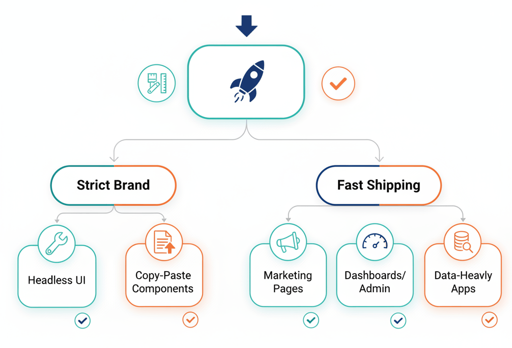
How to Choose from the 14 Best React Component Libraries
Picking the best React component libraries isn't one-size-fits-all. Teams should start by mapping out their project's UI complexity and their team's skill set.
For example, if a brand demands pixel-perfect design and the team has strong frontend specialists, a headless library like React Aria Components puts developers in control. Think of it as buying the raw ingredients instead of ready-made meals. But if teams are racing a tight deadline or developers are less experienced with CSS, a copy-paste library like Untitled UI React or shadcn/ui can help ship fast without getting lost in styling details.
Key questions include:
- Does the team need marketing pages, dashboards, or data-heavy grids?
- Will developers be comfortable customizing unstyled components?
- Is matching an existing Figma design non-negotiable?
The answers should steer the decision.
Mix-and-match strategies for real-world projects
Teams don't have to choose just one. In fact, most teams combine libraries to save time and boost flexibility. Many pair a copy-paste solution for common layouts with headless primitives for unique features. It's like building furniture - sometimes IKEA flatpacks are perfect, other times custom woodwork is needed.
Before locking anything in, teams should prototype key screens using two or three contenders side-by-side. This hands-on test reveals how components fit with workflows. It uncovers hidden snags early.
Mixing libraries is not only possible but practical in 2025. Just be aware of style clashes or duplicated dependencies that can increase bundle size. According to Bits and Pieces, hybrid approaches are standard practice among top teams working on React UI libraries.
Bottom line: pick tools that match your ambition and your reality today. Test on real tasks, not just “Hello World.”
Conclusion
The right React component library sets the stage for speed and quality. It turns weeks of UI grunt work into days, so teams can focus on real product wins.
Start small. Prototype. Adjust. Let your stack evolve with the product. Great apps are built choice by choice — pick well, and give yourself room to grow.
How MYGOM Can Help You Build Better
Choosing the right React component library is just the start. At MYGOM.tech, we build software that fits your needs - from BI platforms to AI automation - and help you get the most from the 14 best React component libraries.
Our Expertise in Modern React Development
We’ve shipped production apps with many of the tools above. We know what fits where - and how to combine libraries without the headaches.
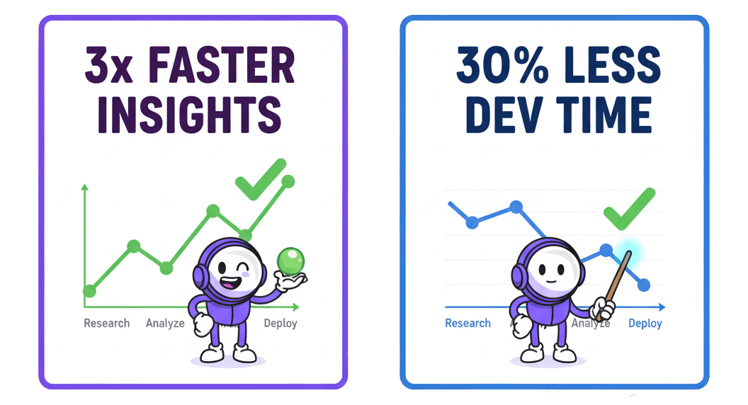
Recent project highlight: Our Business Analyst AI platform (opens in new tab) demonstrates how the right component library choices - combined with expert implementation - deliver measurable results:
- 3x faster access to business insights through optimized UI components
- 30% reduction in development time by choosing the right React UI toolkit
- Scalable architecture that grows with user needs
Let's Build Something Great Together
Whether you need help choosing the right React component library, building a custom design system, or developing a complete application from scratch, we're here to help.
Get in touch with our team (opens in new tab) to discuss your project. We'll help you navigate the options, avoid common pitfalls, and build interfaces that your users will love.

Justas Česnauskas
CEO | Founder
Builder of things that (almost) think for themselves
Connect on LinkedIn